
Matching flooring to existing home decor is the process of aligning color undertones, material choices, and design proportions to create a visually unified interior. Done well, it does more than look good. Proper floor and wall pairing can increase a home’s resale value by 3–5%, making it one of the highest-return decisions in any renovation. Design professionals rely on proven principles like the 60-30-10 rule and undertone matching to guide these choices. This guide walks you through each technique so you can make confident flooring decisions that work with what you already have.
The single most common flooring mistake homeowners make is trying to match colors exactly. Exact color matching creates a flat, monotone look that feels unintentional. The correct approach is matching undertone families instead of surface colors.
Every flooring material and wall color carries an undertone: warm (yellow, red, or orange), cool (blue, green, or gray), or neutral. A warm honey oak floor clashes with a cool gray sofa not because the colors are wrong, but because the undertones conflict. Pair warm with warm and cool with cool, and the room reads as cohesive even when the colors are very different.
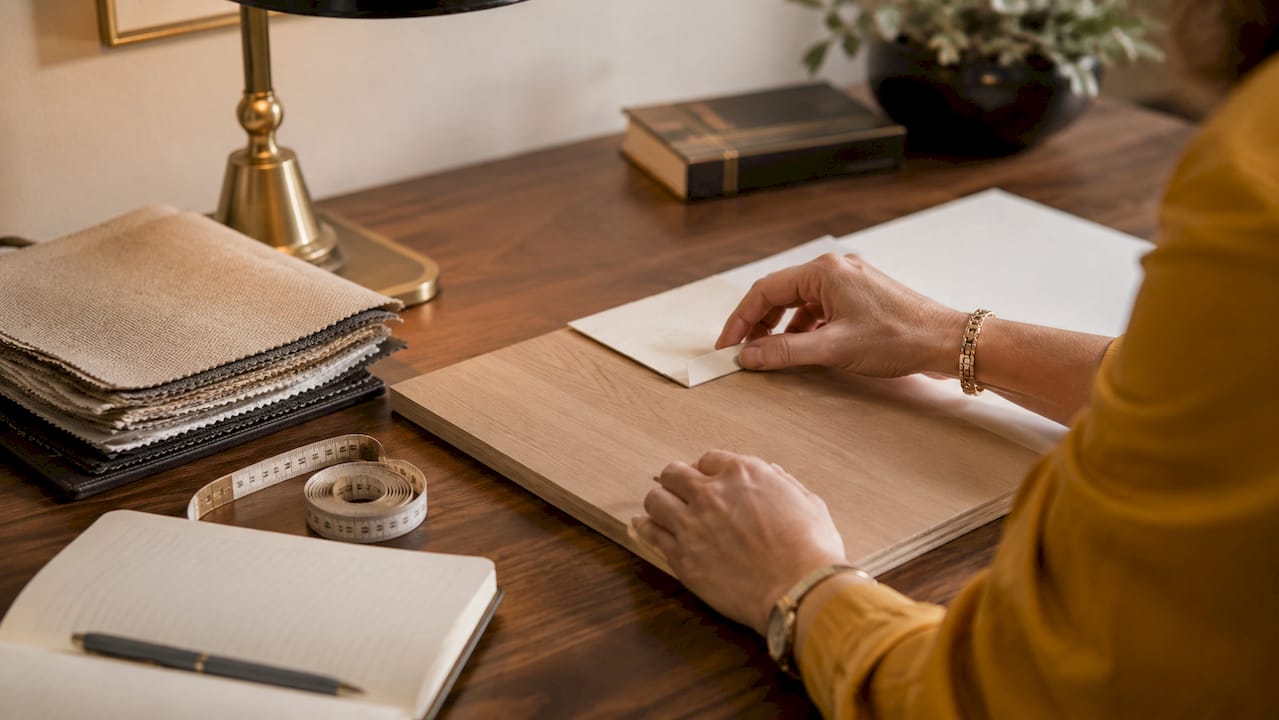
The white paper test is the most reliable way to identify hidden undertones. Hold a sheet of plain white paper next to your flooring sample or furniture piece. The contrast reveals whether the material leans yellow, red, or blue in ways that are invisible when you view it in isolation. Most homeowners skip this step entirely, then wonder why their new floor feels “off.”
Pro Tip: Bring a white card with you when shopping for flooring samples. Hold it against each sample under the store lights, then again at home. The undertone you see at home is the one that matters.
Key undertone mistakes to avoid:
Color balance is the structural foundation of any well-designed room. The 60-30-10 design rule divides a room’s color into three proportions: 60% dominant (walls and large furniture), 30% secondary (floors and rugs), and 10% accents (pillows, art, and fixtures). Floors occupy the secondary role, which means they should complement the dominant color without competing with it.

The shade contrast between floors and walls matters just as much as the color family. Floors that are too close in shade to the walls create a washed-out, undefined look. A difference of 2–3 shades between floor and wall color gives the room visual structure. A light gray wall pairs well with a medium warm wood floor. A deep navy wall works with a pale natural oak or a light stone tile.
Here is how to apply the 60-30-10 rule in practice:
Matching does not mean identical. The most visually interesting rooms use complementary undertones to create depth, not a single color repeated across every surface. Aim for harmony, not uniformity.
For 2026 decor trends leaning toward warm, earthy palettes, this principle is especially relevant. Honey tones, terracotta accents, and natural textures work together precisely because they share warm undertones while varying in shade and material.
Material choice is where aesthetics and practicality meet. The three-material rule organizes flooring across a home into three categories: a hardwood or wood-look base for main living areas, a resilient material like tile or stone for wet zones, and a soft material like carpet or rugs for bedrooms and comfort areas. This structure keeps the home cohesive without requiring every room to use the same floor.
Lifestyle factors should drive material selection before aesthetics do. Homes with kids and pets need scratch-resistant, easy-to-clean surfaces. Luxury vinyl plank (LVP) and porcelain tile both meet that standard while offering a wide range of colors and textures. Hardwood remains the top choice for formal living and dining rooms where traffic is moderate and the warm, natural look supports traditional or transitional decor styles.
2026 flooring color trends favor warm, earthy neutrals like honey, beige, and soft brown over the cool grays that dominated the previous decade. This shift makes it easier to coordinate floors with the warm, natural decor palettes that are currently popular. If your existing decor already leans warm, now is an ideal time to replace cool gray floors with a warmer wood tone or a warm-toned LVP.
| Room | Recommended material | Why it works |
|---|---|---|
| Living room | Hardwood or LVP | Warm tones anchor the room’s dominant color |
| Kitchen | Porcelain tile | Durable, water-resistant, and easy to clean |
| Bathroom | Ceramic or stone tile | Handles moisture; pairs with most wall colors |
| Bedroom | Carpet or wood-look LVP | Adds warmth and comfort underfoot |
| Entryway | Tile or LVP | High traffic, easy maintenance, sets the tone |
Pro Tip: When coordinating multiple flooring types across an open-plan home, keep the undertone consistent even if the materials change. A warm beige tile in the kitchen and a warm honey LVP in the adjacent living room read as intentional. The same warm beige tile next to a cool gray LVP creates visual friction.
For room-by-room flooring decisions, sun exposure also plays a role. South-facing rooms with strong natural light can handle darker floors without feeling heavy. North-facing rooms benefit from lighter, warmer tones to compensate for cooler, lower-intensity light.
Most homeowners view flooring samples only under store lighting, then regret the choice once the floor is installed. Color appearance shifts significantly under morning sunlight, afternoon light, evening incandescent light, and artificial overhead lighting. Testing samples at home under all four conditions prevents costly errors.
The testing process works best when you treat it like a staging exercise:
Area rugs and consistent trim colors create what designers call a “quiet thread” of harmony when you use different flooring materials across rooms. White or off-white baseboards and door trim act as a neutral reset between zones, so the eye accepts the transition naturally. Transition strips between flooring types should match either the lighter or darker floor, not split the difference.
Limiting your home to 2–3 flooring types avoids the “showroom maze” effect, where too many materials compete for attention and the home feels choppy. One flooring type for main living areas, one for wet zones, and one for bedrooms covers most homes cleanly. Every additional material type requires a deliberate visual bridge to maintain cohesion.
| Testing condition | What to look for |
|---|---|
| Morning natural light | True color and warm vs. cool shift |
| Midday direct sun | Glare, fading risk, and saturation |
| Evening incandescent light | Yellow shift in warm-toned floors |
| Overhead LED or fluorescent | Blue or green cast on cool-toned materials |
Matching flooring to existing home decor requires coordinating undertones, applying the 60-30-10 color rule, and selecting materials that fit both your style and your lifestyle.
| Point | Details |
|---|---|
| Match undertones, not colors | Pair warm-toned floors with warm decor and cool-toned floors with cool decor for visual harmony. |
| Apply the 60-30-10 rule | Floors occupy the 30% secondary role and should differ 2–3 shades from the dominant wall color. |
| Follow the three-material rule | Use hardwood or LVP for living areas, tile for wet zones, and carpet for bedrooms. |
| Test samples at home | View flooring samples under morning, evening, and artificial light before committing. |
| Limit flooring types | Stick to 2–3 flooring materials across the home to avoid a fragmented, chaotic look. |
The most expensive flooring mistake I see is not choosing the wrong color. It is choosing in the wrong order. Homeowners pick paint first, then furniture, then flooring last, as if the floor is an afterthought. Floors are the largest fixed surface in any room. They should be selected before walls, not after.
Start with your fixed elements: flooring, cabinetry, and any existing furniture you are keeping. Then choose your wall color to complement those anchors. Paint is the easiest and cheapest thing to change. Flooring is not. This sequence alone eliminates most of the regret I hear from homeowners after installation.
The second thing I have seen trip people up is confusing “matching” with “identical.” A room where the floor, walls, and furniture are all the same shade of beige is not cohesive. It is boring. Real harmony comes from varied shades within the same undertone family, with deliberate contrast at the 2–3 shade level. The 60-30-10 rule exists precisely because our eyes need proportion and contrast to find a room pleasing.
For choosing a bathroom color scheme, the same logic applies. Fix the tile first, then build the wall color and vanity finish around it. The room will come together faster and with far fewer costly revisions.
— Anna
Choosing the right floor for your home is easier when you have real samples, expert guidance, and a full product range in one place.
At The Kitchen, Bathroom & Flooring Store, we carry hardwood, luxury vinyl plank, carpet, and tile and stone options across warm and cool palettes to fit the 2026 trends and your existing decor. Our design team helps you identify undertones, apply the 60-30-10 rule to your specific rooms, and test samples against your actual walls and furniture. You do not need a separate designer or contractor. We handle the full process from selection through professional installation. Visit our Jacksonville flooring showroom or explore our kitchen remodeling packages to see how coordinated flooring transforms the whole home.
Match the undertone family first, not the exact color. Warm-toned floors pair with warm walls, and cool-toned floors pair with cool walls, with a 2–3 shade difference between them for visual contrast.
Use the white paper test: hold a sheet of plain white paper next to the flooring sample. The contrast reveals whether the material carries a yellow, red, or blue undertone that is otherwise hard to see.
Limit the home to 2–3 flooring types. More than that creates a fragmented look that designers call the “showroom maze” effect, where no single material reads as intentional.
Yes. Color appearance shifts significantly under different lighting conditions. Always test flooring samples in your home under morning, evening, and artificial light before making a final decision.
Warm, earthy neutrals like honey, beige, and soft brown are the leading flooring color choices in 2026, replacing the cool gray tones that were popular in previous years.