
The fastest way to land on the right color scheme options for your kitchen remodel is to start with what can’t change, your floor, countertop, or any wood staying put, then match your new colors to that surface’s undertone. Everything else, from cabinet color to wall paint, gets built around that one leader surface. Designers at Benjamin Moore, Sherwin-Williams, and Farrow & Ball are all steering clients toward warmer neutrals and deeper, moodier tones for 2026, a real pullback from the stark white kitchens of the last decade.
If you want a shortcut before reading further, here are three directions that cover most homeowners:
Pro Tip: Before you buy a single gallon, paint a two-foot-tall sample board and prop it against your countertop and floor sample. A paint chip the size of a playing card will lie to you every time.
The most reliable kitchen color scheme starts from a fixed surface’s undertone, applies the 60-30-10 proportion rule, and gets confirmed with large sample boards before any paint is purchased.
| Point | Details |
|---|---|
| Start from fixed finishes | Match new colors to the undertone of your floor, counter, or any wood staying in place. |
| Use the 60-30-10 rule | Balance dominant, secondary, and accent colors across walls, cabinets, and hardware. |
| Test large, not small | Use 2×2-foot sample boards against real surfaces, checked morning, midday, and evening. |
| Match trend to timeline | Warm neutrals age well long term; deep moody tones and bold pockets suit shorter-term style updates. |
| Get materials coordinated together | The Kitchen, Bathroom & Flooring Store builds palette, countertop, and flooring decisions into one project timeline. |
Every strong kitchen palette does three jobs at once: it sets a mood, it works with your fixed materials, and it holds up under real light. Below are five palette families worth considering, organized by the feeling they create rather than by trend buzzword alone.
This is the safest and currently the most requested direction. Think warm whites, soft greige, and putty tones rather than the cool, gray-heavy neutrals that dominated the 2015 to 2020 era. Designers now describe the shift as a move away from stark white toward palettes that feel nuanced and grounded.
A workable combination: walls in a warm white like Benjamin Moore’s “White Dove,” perimeter cabinets in a soft greige, and an island one shade deeper for contrast. Warm neutrals suit kitchens with limited natural light because they reflect warmth rather than looking flat and gray by 4 p.m. They’re also the most timeless option here, which matters if you’re weighing resale value.
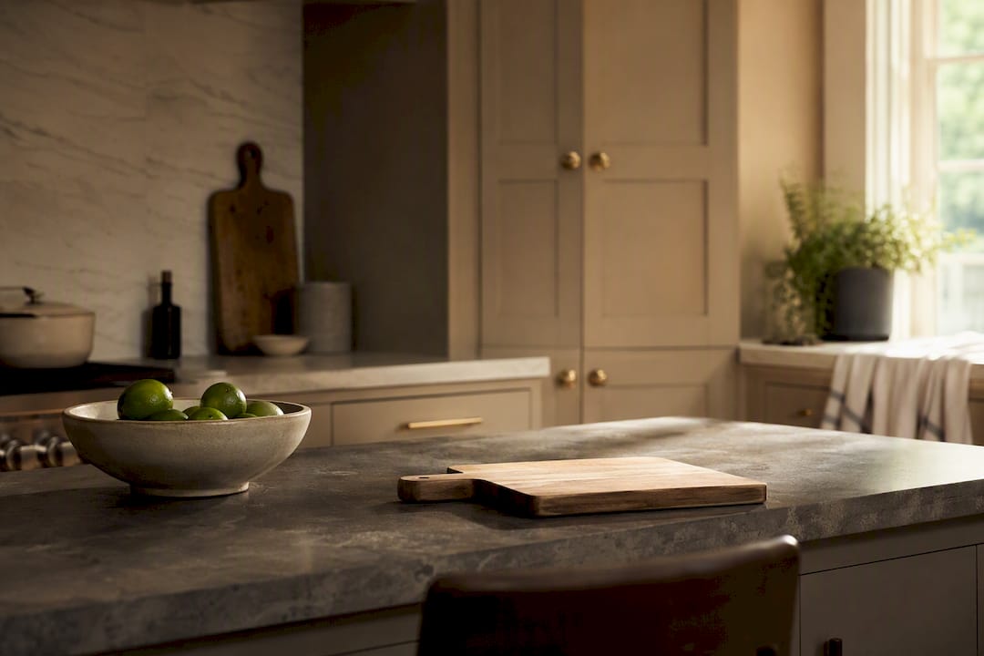
Inky blues, forest greens, and brown-inflected tones are showing up on islands and full cabinet runs alike. Designers are pointing to atmospheric, brown-toned and inky blue palettes as a defining 2026 move, often paired with warm white counterpoints so the kitchen doesn’t feel like a cave.
A strong pairing: cabinets in a deep tobacco brown or navy, walls in warm white, and brass hardware to keep the mood rich instead of heavy. Reserve full-room deep color for kitchens with generous windows or skylights. In a smaller, dimmer kitchen, confine the dark tone to the island or a single wall of upper cabinets.
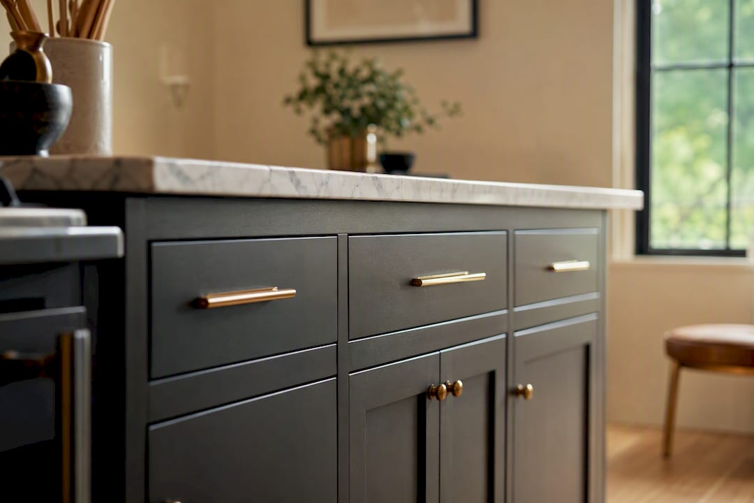
Two-tone kitchens aren’t new, but the execution has gotten gentler. Instead of stark black-and-white contrast, 2026’s version leans on related undertones, a warm taupe upper paired with a slightly deeper taupe-brown lower, so the transition feels layered rather than jarring. That’s a real shift from the high-contrast two-tone kitchens of a few years ago toward softer, related-undertone pairings.
The composition rule most designers follow: darker tones go low, lighter tones go high. Base cabinets or the island carry the deeper color, uppers stay lighter, which keeps the room grounded instead of top-heavy.
Soft, grayed-down pastels, dusty sage, faded terracotta, muted lavender, are having a real moment, especially on islands and cabinetry in kitchens that want personality without full commitment to a bold hue. Muddy pastels are one of the clearest 2026 signals designers are naming, alongside deep purples and mahogany-adjacent browns.
Sage cabinets with white oak open shelving and a honed marble or quartz counter is a combination that reads current without feeling trend-chasing.
Not every kitchen needs a full-color commitment. A buttery yellow pantry door, a cobalt range hood, or a single wall of tile in a saturated hue gives you a trend-forward pop without repainting the whole room. Designers describe this as one of the more approachable 2026 moves, strategic pockets of bold color rather than an all-over statement.
Pro Tip: Repeat your accent color in at least two places, a painted door and a set of pendant lights, or an island and a runner rug, so the pop reads as intentional rather than accidental.
| Palette | Best For | Placement |
|---|---|---|
| Warm neutrals | Low light, resale-focused remodels | Walls, perimeter cabinets |
| Deep and moody | Bright kitchens, drama-seekers | Island, single accent wall |
| Two-tone | Larger or open-plan kitchens | Uppers light, lowers dark |
| Muddy pastels | Personality without commitment | Island, open shelving |
| Bold pockets | Small budgets, rental-adjacent updates | Accents, one wall or door |
Start by auditing what’s staying. If your floor, countertop, or a wood island top isn’t changing, that surface is your leader. Everything else, cabinet color, wall paint, backsplash, gets chosen to complement it, not compete with it. Kitchens with mismatched undertones (a cool gray floor under warm oak cabinets, for example) are the number one reason a finished remodel looks “off” even when every individual piece was a good choice on its own, since fixed materials act as the de facto palette whether you planned around them or not.
Ask yourself these questions before picking anything:
This proportion rule keeps a palette cohesive instead of letting three good colors fight for attention. Small kitchens generally do better with one dominant color to avoid visual chopping, while larger or open-plan kitchens have the square footage to support two-tone or full color-drenching without feeling busy.
Small paint chips are the most common reason homeowners end up repainting within a year. A two-inch chip under fluorescent store lighting tells you almost nothing about how that color will behave against your granite counter at 7 a.m.
Pro Tip: Test your cabinet and wall colors together on adjacent boards, never in isolation. Colors that look great alone can clash once they’re sitting six inches apart.
Color doesn’t live in isolation in a kitchen. It sits next to wood cabinetry, stone counters, and metal hardware, and those materials carry their own undertones that either support or undercut your paint choice.
If your flooring is already installed and skews cool or gray, pairing paint with your existing floor rather than fighting it will save you a repaint later.
Not every color change requires the same investment, and the gap between options is bigger than most homeowners assume.
Order your countertop and flooring samples before finalizing paint, not after. Changing a wall color after the counters and floor are locked in is far cheaper than reordering stone once cabinets are already painted to match the wrong slab.
Even a well-planned palette can go sideways once it’s actually on the walls. A few issues show up again and again.
Bring in a professional when you’re combining multiple finish changes at once, cabinets, counters, and flooring together, since that’s where undertone conflicts compound fastest. A simple wall repaint is usually a safe DIY call.
Pro Tip: For high-traffic family kitchens, mid-tone colors in a satin or eggshell finish hide fingerprints and daily wear far better than either stark white or very dark, glossy finishes.
Color and light work together, not separately. Warm neutrals and muddy pastels tend to make a kitchen feel calm and lived-in, especially under warm-temperature bulbs. Deep, moody tones like navy or forest green create a more dramatic, restaurant-like atmosphere, but they need generous task lighting under cabinets to avoid feeling dim during food prep. Bold accent pockets, a yellow door or a cobalt hood, tend to energize a space and work well in kitchens that double as gathering spots. If your kitchen leans heavily on overhead fluorescent or cool LED lighting, test any warm palette under that exact lighting before committing, since cool bulbs can wash out warmth you’re counting on to make a color feel right.
We start every color conversation with countertops, not paint, because stone and quartz slabs are the hardest material to change once ordered and the most likely to dictate everything else.
Starting with the most variable material first cuts down on the back-and-forth reordering that stretches timelines and budgets.
Clients consistently tell us the sample-testing step is what saved them from a color they would have regretted, seeing a full-size board next to their actual counter changes the decision every time.
Our in-house measuring and coordinated ordering means paint, countertop, and flooring decisions get scheduled together instead of in separate, disconnected phases. If you want that same process applied to a full kitchen remodel, our budget-friendly kitchen remodel planning guide walks through what that sequencing looks like in practice.
Most kitchen color advice online treats palette selection like picking a favorite hue off a mood board. That’s backward. The homeowners who end up happy with their remodel a year later are the ones who treated color as the last decision, not the first, built around a countertop or floor that was already locked in.
The conventional wisdom oversells drama. Full color-drenching photographs beautifully, but it’s the highest-risk choice for a room you’ll stand in every day under changing light. A contained pocket of bold color, or a two-tone pairing with related undertones, delivers most of the visual interest with a fraction of the regret risk if your taste shifts in three years.
If there’s one thing worth prioritizing above trend-chasing, it’s testing. A vertical sample board against your actual counter, checked under morning and evening light, will tell you more in ten minutes than an hour of scrolling design inspiration ever will.
Picking a palette from a screen is one thing. Watching it hold up next to your actual counter, cabinets, and floor under your kitchen’s real light is another, and that gap is exactly where most DIY color plans fall apart. The Kitchen, Bathroom & Flooring Store handles color, cabinetry, countertops, and flooring under one roof, so your paint choice gets tested against the same materials it will live with permanently, not guessed at in isolation.
That matters most for homeowners juggling multiple finish decisions at once, wood tone, stone color, hardware finish, wall paint, without wanting to coordinate four separate contractors. Our design team builds palette options around your fixed materials first, then walks you through full-size samples before anything gets ordered. If you’re weighing a full kitchen refresh, browse our tile and stone flooring selection to see how countertop and floor options pair with the palettes above, or request a design consultation to get a personalized color plan built around your space.
What is the best color scheme for a small kitchen remodel? One dominant color across walls and cabinets, in a warm neutral tone, tends to work best in small kitchens because it avoids the visual chopping that two-tone or heavy color-drenching can create in a tight footprint.
How do I know if a paint color has the wrong undertone for my kitchen? Test a 2×2-foot sample board directly against your countertop and floor under natural daylight and your actual evening bulbs; small chips rarely reveal undertone shifts that a full-size board will show immediately.
Should cabinets and walls be the same color or different colors? Either works, but if you choose two colors, keep them in related undertones rather than stark contrast, and place the deeper tone lower on the island or base cabinets for a grounded look.
Are dark kitchen colors going out of style in 2026? No, deep moody tones like navy, forest green, and brown-inflected hues remain a strong 2026 direction, particularly on islands and single accent walls in kitchens with good natural light.
How much does it cost to change a kitchen color scheme? Wall paint is the least expensive option, respraying existing cabinets costs more due to prep and finish work, and replacing cabinets entirely carries the highest cost and longest timeline.