
Color controls a bathroom’s mood. Your nervous system responds to hue before you consciously register why a space feels calm or energizing, so the smartest move is deciding the mood first and choosing colors second. Once you know what you’re after, three actions get you there:
Color choice in a bathroom works best when the mood is decided first and every subsequent choice, from hue to lighting to finish, supports that single goal.
| Point | Details |
|---|---|
| Decide mood before color | Name calm, energizing, or dramatic in one sentence before shopping for paint or tile. |
| Apply 60-30-10 proportionally | Use 60% base, 30% secondary, 10% accent to keep any bathroom palette balanced. |
| Test large samples first | Paint 2x2 foot patches and view them morning, midday, and night before committing. |
| Match bulb temperature to mood | Use 2700 to 3000K for cozy palettes and 3500 to 4000K for energizing, brighter rooms. |
| Get professional palette help | The Kitchen, Bathroom & Flooring Store builds mood-first color choices into its bathroom remodeling consultations. |
Color theory in bathrooms works because your body reacts to hue on a biological level, not just an aesthetic one. Cool colors like blue and green tend to activate the parasympathetic nervous system, lowering heart rate and easing tension, while warm colors like yellow and orange stimulate the sympathetic nervous system and raise alertness. That’s the science behind why a spa-like bathroom leans blue-green and a morning-routine bathroom often leans warmer.
The four variables that actually matter:
Bathrooms distort all four. Mirrors bounce light back and forth, glossy tile reflects and amplifies whatever hue surrounds it, and standing water changes how a blue-green wall reads throughout the day. Because you stand inches from these surfaces during a routine you repeat daily, proximity and reflectivity intensify color perception far more than in a living room, where you view color from across the room. A shade that looks subtle on a paint chip can feel saturated once it’s bouncing off a mirror and a soaking tub.
Before you touch a single swatch, finish this sentence: “I want this bathroom to feel ___.” Calm, energized, dramatic, restorative. Skipping this step is how homeowners end up with a trendy color they regret in eight months, because they picked based on a photo instead of a feeling.
Once you have your mood, the 60-30-10 rule turns it into an actual plan:
Designers rely on this proportion system because it’s rooted in classic design balance principles, and it works just as well in monochrome schemes by varying value and saturation instead of hue. A soft sage base, a warm white vanity, and matte black fixtures follow the same 60-30-10 logic as a bold navy-and-brass combination.
Pick a focal material before you finalize anything; for guidance on coordinating colors effectively, see The role of colour matching trims in home design. A patterned tile, a statement vanity, or a piece of art sets the undertones for everything else in the room. If your tile has warm gray undertones, a “cool” blue paint next to it will look muddy no matter how nice it looked on the chip.
Pro Tip: Pull your focal material’s undertone first, then shop paint chips against it in person. Undertones are nearly impossible to judge from a phone screen or a website swatch.
The single biggest mistake homeowners make is trusting a paint chip under store lighting. A color that looks perfect under fluorescent showroom bulbs can shift completely under your bathroom’s mixed daylight and vanity lighting.
The testing protocol that actually prevents repaints:
Light bulb temperature matters just as much as the paint itself. Bulbs in a lower Kelvin range flatter warm palettes and support a cozy, relaxed mood, while bulbs in a higher Kelvin range support clarity and work better with energizing, brighter palettes. A north-facing bathroom gets cooler, flatter daylight all day, which can make warm colors feel muted and cool colors feel colder than intended. A south-facing bathroom gets warmer, more direct light that can wash out pale colors and intensify saturated ones.
Finish and material choices bend your color decisions too:
Don’t rule out darker colors out of fear they’ll shrink the room. A deep hue paired with layered lighting and a reflective surface, like a large mirror or glossy tile, often reads richer rather than smaller. It’s the lighting plan, not the paint color alone, that determines whether a dark bathroom feels cramped or cocooning.
Pro Tip: If you’re nervous about committing to a dark wall, test it on the least-lit wall first. If it still reads warm and inviting there, it will look even better on a wall that catches more light.
For readers weighing metal finish choices alongside paint, coordinating fixtures with your palette prevents the mismatch that undermines an otherwise solid color plan.
Once you’ve named your mood, these combinations translate it into an actual shopping list.
Calming: Low-saturation blues or sage greens for the 60% base, paired with a warm neutral like soft ivory or greige for the 30% secondary. Skip high-contrast, high-saturation accents here entirely. A calming bathroom depends on everything staying gentle, including the 10% accent.

Energizing: A clear turquoise or bright aqua works as an accent color, layered against a crisp white base and paired with strong morning light. Use it sparingly. This palette leans hardest on the accent tier of the 60-30-10 rule rather than the base.
Dramatic or cozy: Deep navy or forest green as your dominant color, balanced with layered warm lighting in the 2700 to 3000 Kelvin range, and reflective accents like a brass fixture or a large mirror to keep the room from feeling heavy.
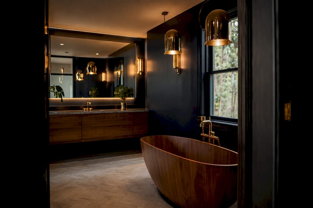
Restorative: Muted eucalyptus or dusty lavender tones, similar to the calming palette but with slightly more saturation, work well for a bathroom meant to feel like a reset rather than a full sedative.
Neutral and timeless: Warm greige as the base, layered textures (a woven bath mat, a matte tile) for depth, with a small trend color relegated to the 10% accent tier where it’s easy to swap out later.
One caution worth naming: saturated, high-intensity yellow can overstimulate rather than energize when used as a dominant wall color. Pale, warm yellows work far better as accents than as a 60% base.
Industry coverage from the ISH 2025 trade fair points toward softer, more muted palettes, with manufacturers embedding color directly into fixtures and sanitaryware rather than relying on paint alone. That shift makes muted tones a safer long-term bet than saturated trend colors, since they’re showing up in permanent materials, not just seasonal paint collections.
The Kitchen, Bathroom & Flooring Store builds mood-first color selection directly into design consultations, so the palette isn’t an afterthought bolted onto a finished layout.
Bring your mood statement and two material samples to a showroom consultation, and the design conversation moves faster.
The habit that saves homeowners the most regret is the least glamorous one: paint a real sample, live with it 48 hours, and resist judging it on day one. Mood-first thinking sounds soft until you watch someone choose a color because it felt right in a photo, then live with a bathroom that fights their morning routine every day. For a permanent remodel, that’s exactly the kind of decision worth talking through with a designer before the paint goes on the wall.
Testing samples and mapping the 60-30-10 rule on your own works, but a full remodel adds variables. Tile undertones need to match plumbing fixtures, cabinetry finishes need to hold their color for a decade, and lighting has to be planned before drywall closes up the walls. The Kitchen, Bathroom & Flooring Store’s bathroom remodeling package covers design consultation, curated palette selection, product sourcing, and professional installation under one roof, so you’re not coordinating separate contractors for tile, vanities, and paint.
Bring your mood statement and two material samples you’re drawn to. That gives the design team a real starting point instead of a blank slate. If financing is a factor, ask about the monthly payment plans available through the bathroom remodeling package, and get a project timeline started before your next free weekend.