
For most tile projects, a neutral mid-tone grout that matches or gently blends with your tile is the safest, easiest-to-maintain choice. Save darker or high-contrast grout for when you actually want that graphic, defined look. Either way, grout type and sealing change how the color reads and how long it stays looking good, so test before you commit.
TL;DR:
- Matching grout within one or two shades of the tile creates a seamless look that emphasizes the pattern and makes small or busy tiles feel larger.
- Tonal grout, a half-shade lighter or darker than the tile, balances concealment of dirt with avoiding hard visual lines, making it ideal for large-format or natural stone tiles.
- Testing grout colors in person on a sample panel under real lighting conditions is crucial, as store samples often do not accurately reflect the final appearance.
- Neutral mid-tone colors like greige, taupe, and mocha are recommended for high-traffic or moisture-prone areas because they better hide dirt and wear over time.
- Coordinating grout, cabinets, countertops, and flooring as a unified palette enhances visual harmony and can help prevent clashing or mismatched finishes.
Before you fall in love with a chip on a color card, run through these rules. They come from designer practice and manufacturer guidance, and they will save you from a redo six months from now.
Pro Tip: Bring your countertop sample and a cabinet door (or a photo of both) to the grout counter. Grout that looks perfect next to a bare tile can clash the moment it sits under your actual finishes.
Matching grout, chosen within a shade or two of the tile, blurs the joint lines so the eye reads the floor or wall as one continuous surface. This approach works especially well on small-scale or textured tile, like penny rounds or mosaic sheets, where visible grout lines would otherwise chop the pattern into a distracting grid.
Contrast does the opposite job on purpose. Dark grout against white subway tile, for instance, turns the joint lines into the design feature, tracing every brick-set course and giving a kitchen backsplash real graphic punch. That same contrast on a large-format porcelain slab can look busy fast, since fewer, longer grout lines draw more attention per line than the dozens of tiny joints in a mosaic.
Tonal grout sits between the two. It’s close enough to the tile color to stay quiet but different enough to still define the shape and layout of each piece, which tends to be the safer bet on large-format tile, natural stone look-alikes, or anywhere you want the material itself, not the grout, to be the star.
Texture matters too. Rougher, matte tile absorbs light and tends to forgive a slightly-off grout match, while glossy or polished tile reflects light in ways that make even minor color mismatches obvious.
The grout chip in the store almost never matches the grout in your finished room. Sanded, unsanded, and epoxy grouts each have different textures and curing behaviors that shift how a pigment reads once installed. Sanded grout, with its coarser texture, can look a shade lighter and more matte than the same color in unsanded form, which is smoother and slightly denser looking.
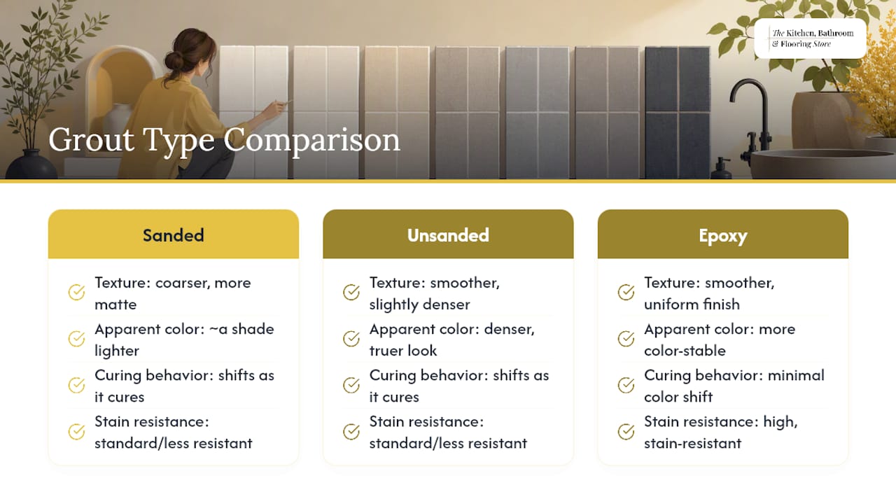
Cement-based grouts also shift color as they cure. What looks correct on day one can lighten or deepen slightly over the following days as the grout fully sets, which is one reason epoxy and single-component grouts tend to offer more color-stable, stain-resistant results over the long run, even though they cost more and install less forgivingly than standard cement grout.
Lighting adds another layer. A grout that looks warm gray under bright showroom lights can look almost blue under your kitchen’s LED fixtures, an effect called metamerism. Always judge a sample under the same light you’ll actually live with, and remember that a honed or textured surface finish will always read differently than a polished one, even in identical pigment.
Different rooms put grout under different stress, so the “safe” color changes depending on where you’re standing.
Across every room, designers generally caution against pure white grout in high-traffic or wet areas because it visibly ages faster than a softly toned white or light gray.
Skipping this step is the single most common reason homeowners end up unhappy with their grout. Manufacturers and designers agree: a printed swatch or a phone screen is a starting point, never a final answer.
Pro Tip: If you’re worried about how a grout will look with a specific stone or glass tile, ask your installer for a small trial swatch area on an inconspicuous section of the actual job before they grout the whole room.
Manufacturer palettes are a genuinely useful starting point, but they come with a built-in limitation worth knowing before you shop.
Treat every digital tool as a shortlist generator, then confirm your top two or three picks with a physical sample panel in your own space.
Before you buy, run through one final checklist: your desired relationship (match, tonal, or contrast), the grout type you’re using, your joint width, whether you’ve built a cured sample panel, your sealing plan, and a realistic maintenance schedule for the finished space.
That’s a lot to manage solo, which is exactly where a showroom earns its keep. A showroom design team can walk you through grout and tile pairings side by side, build sample panels so you see the real combination before installation day, and handle sealing and installation as part of the same project, so nothing gets lost between separate contractors.
The most frequent mistake is choosing grout in isolation, under store lighting, without the tile, cabinetry, or countertop anywhere nearby. A grout that looks perfect on its own chip can clash badly once it’s surrounded by your actual finishes. Fix this by bringing samples of everything into one room before you decide.
The second mistake is picking pure white for a busy household. It looks stunning on install day and shows every bit of grease, soap scum, and grout haze within weeks. A soft, tonal white or light gray gets you nearly the same clean look with far less visible wear.
Third, homeowners often underestimate joint width. A 1/16 inch joint on large-format tile shows very little grout color at all, so a bold contrast choice barely registers. A 3/8 inch joint on handmade-look tile shows a lot of grout, so the same bold color reads far more dramatically than expected. Match your color boldness to your joint size.
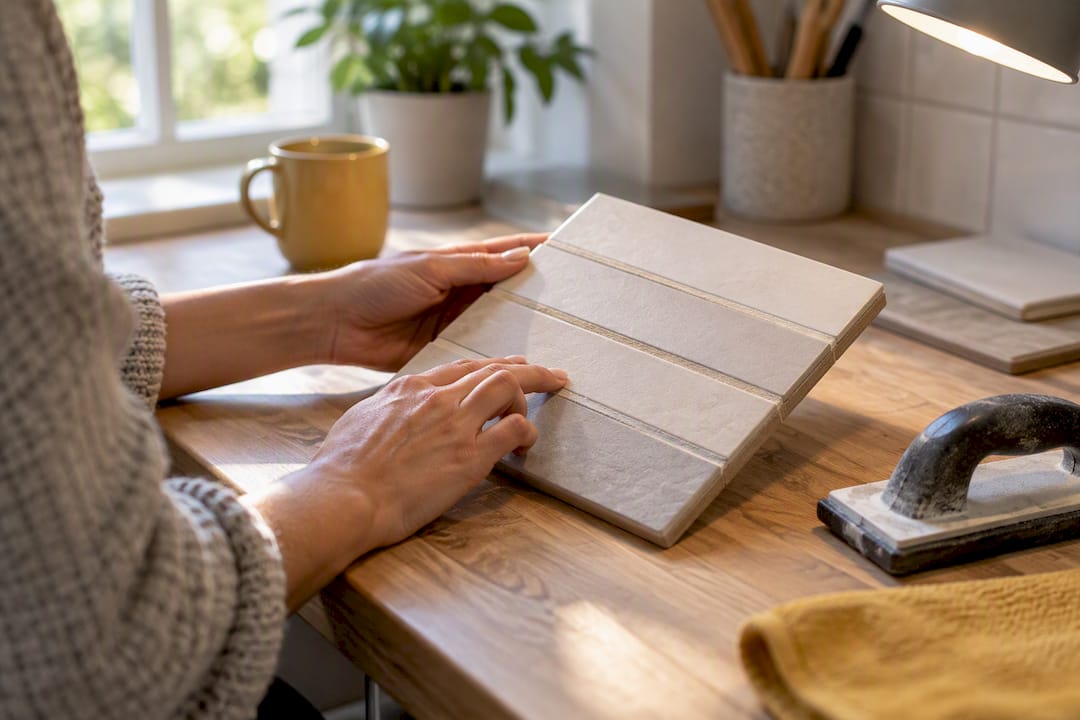
Fourth, skipping the test panel is the mistake that causes the most regret. Colors shift with cure time, lighting, and finish texture, and a decision made from a tiny chip rarely holds up once it covers 40 square feet of floor.
Finally, some homeowners chase a trend color that clashes with a stone or cabinet undertone they already own. Grout should support your existing materials, not compete with them for attention.
Grout color does more than fill the gaps between tiles. It’s the frame around every single piece, and that frame controls whether your eye sees the floor as one surface or as a collection of individual pieces.
A close match essentially erases the grid. Your eye stops counting tiles and starts reading the whole floor or wall as a single plane, which is why matching grout makes small rooms and small-format tile feel less cluttered and more spacious. This is especially useful in a small bathroom, where a busy grid of visible grout lines can make an already tight space feel smaller than it is.
Contrast grout does the reverse: it makes your brain register pattern before material. A checkerboard floor, a herringbone backsplash, or a brick-set subway wall only reads as that pattern because the grout lines are visible enough to trace the shape. Remove the contrast, and the pattern nearly disappears into a texture instead of a shape.
Grout color can also correct or exaggerate a tile’s undertone. A warm beige tile paired with a cool gray grout will fight itself visually, making both materials look slightly off. The same tile paired with a warm greige grout looks intentional and cohesive. This is why designers so often recommend testing grout against the tile’s actual undertone rather than against its general color family. A “gray” tile can lean blue, green, or purple, and the wrong gray grout will fight that undertone every time you walk past it.
Grout rarely lives in isolation. It sits in a room with cabinetry, countertops, and flooring, and the strongest results come from treating all four as one palette rather than four separate decisions.
Start with whichever material is hardest or most expensive to change, usually the countertop or the cabinetry, and let grout follow its lead. A warm quartz countertop with gold flecking generally pairs better with a warm greige or taupe grout than a stark cool gray, even if the tile itself is neutral. Our guide to selecting a bathroom color scheme walks through exactly this kind of layered decision for vanity, tile, and wall color together.
In the kitchen, backsplash and cabinet color choices often set the tone for grout more than the tile itself does, since the backsplash sits at eye level and gets noticed first. Dark cabinets with a light countertop often call for a mid-tone grout that bridges the two rather than matching either one exactly.
Flooring grout has a slightly different job: it needs to read well next to baseboards, adjacent flooring transitions, and furniture legs, not just the tile itself. If your home has hardwood or luxury vinyl flowing into a tiled kitchen or entry, a grout that echoes the wood’s undertone, warm versus cool, tends to make the transition between materials feel planned instead of accidental. One full-home renovation case study from Y&CO Build’s Galley Avenue project shows this kind of coordinated material planning across an entire home, where flooring, tile, and finish choices were treated as one connected decision rather than room-by-room afterthoughts.
Most grout advice online treats color like a pure aesthetic call, a swatch you pick because you like it. That’s backwards. The research and the technical guidance both point the same direction: grout color is really a maintenance decision wearing a design decision’s clothes. Practical upkeep tends to matter more than pure aesthetics in high-traffic or wet areas, and a slightly darker or mid-tone neutral usually outperforms a trendy light color once real life happens to it.
The overrated piece of conventional wisdom is the idea that white grout is a safe, classic default. It photographs beautifully and looks terrible in a real kitchen within a year. The underrated piece of advice is the test panel. Homeowners treat it as optional busywork when it’s actually the single step that prevents almost every grout regret I’ve seen discussed. Cure time, lighting, and texture change color enough that skipping this step is a gamble with your whole floor.
If you take one thing from this guide, prioritize the test panel over the chip. Pick your color family first, then confirm it in your own light, on your own tile, before anyone mixes a bag of grout.
— Anna
Picking a grout color from a chip is a guess. Picking it in our showroom, next to your actual tile, cabinet sample, and countertop slab, under real lighting, is a decision you can trust before installation day even starts.
The Kitchen, Bathroom & Flooring Store handles the entire process under one roof: design consultation, physical sample panels, sealing recommendations, and professional installation, so you’re never coordinating separate contractors for tile, grout, and finish work. If you’re planning a full kitchen update, our Kitchen Remodeling Packages cover design through installation with financing options available. For bathrooms, where grout choice matters most because of daily water exposure, our Bathroom Remodeling Packages include tile and grout selection as part of the full renovation. Stop by our showroom or request a design consultation to see sample panels built with your actual tile before you commit to a color.
Neither is automatically correct; it depends on the effect you want. A tonal grout, close in value to the tile but not identical, tends to hide dirt and wear better than either a stark light grout or a very dark one, especially on floors.
Neutral tones like greige, taupe, and light-to-medium gray remain the most consistently recommended choices because they hide daily soil better than pure white or very dark grout. These shades also pair easily with most tile colors, which is part of why they show up so often in kitchens and bathrooms.
Manufacturers like CUSTOM Building Products and MAPEI publish online color selectors with full palettes and visualizer tools. Treat these as a starting shortlist and confirm your final pick with a physical sample panel, since printed and digital colors only approximate the installed result.
Mid-tone neutrals like greige, taupe, and mocha resist showing everyday grime better than pure white or true black. Pure white shows soil quickly, while very dark grout can show mineral deposits and haze over time, which is why a soft, muted mid-tone is usually the more forgiving long-term choice.
Yes. Design consultations at The Kitchen, Bathroom & Flooring Store include building sample panels with your chosen tile and grout so you can confirm the color in person before installation. Current pricing for kitchen and bathroom remodeling packages is available directly on the Kitchen Remodeling Packages and Bathroom Remodeling Packages pages.